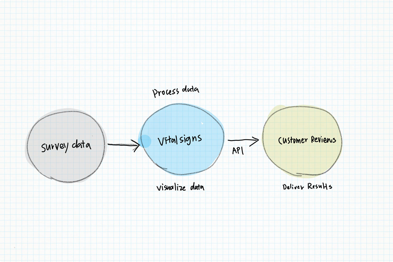
VitalSigns

As a business owner or marketer, data is crucial for making informed decisions about your customer journey and conversions. That's where VitalSigns comes in. Our data dashboard lets you access and analyze the data collected from your Online Buyer Survey and Site Abandonment Survey, as well as view comments from actual customers.


With VitalSigns, you'll have a clear picture of customer pain points and successes, allowing you to fine-tune your strategy and increase conversions. And because it's a SaaS platform, your team can easily collaborate and access data anytime, anywhere. In addition to improving conversions, VitalSigns also helps track key performance indicators and gather valuable voice of customer feedback.


Project Team

UX Manager

Senior UX/UI Designer

1 Product Owner

1 Business Owner

4 FEDs

My Role

UX Manager

Tools

FIGMA

Cinema4D


Our team quickly realized that the most effective way to present the data was through interactive graphics and charts. As we played with various formats, it became clear that adding in visual elements not only improved the overall aesthetic, but also made it easier for users to understand and interact with the information.

Real-time updates allowed us to showcase current trends and changes in consumer sentiment, while also providing the option for users to drill down into specific demographics or categories. The end result was a visually appealing presentation of data that increased user adoption and site activity. It was a win-win for both our team and our customers.


A Fresh Perspective

When I first began work on the dashboard design team, I quickly encountered a major hindrance - our component library was outdated and lacking. But with the help of my lead designer, we were able to come up with solutions and create a new robust library.

Along with this, we also developed updated brand guidelines to not only improve efficiency in creating pages, but also refresh the visuals with an ADA compliant score. It was a collaborative effort, but the end result was worth it - our dashboards are now more modern and user-friendly. This was certainly a challenge, but together we were able to tackle and overcome it.


Increase Digestibility

As our platform continued to grow and add new users, it became clear that our current methods of displaying data were not sufficient. Many of our merchant partners were struggling to interpret the numbers and find patterns in their sales and traffic.

That's why we decided to diversify the way we presented this information, including a wider range of charts and graphs. This not only made it easier for them to understand their own data, but also allowed us to highlight important trends and insights.


The Results


The Numbers


141,711

Active Credentials

5k+

Retailers Each Year

25 mM Surveys

Worth of Data Each Year


Related Projects